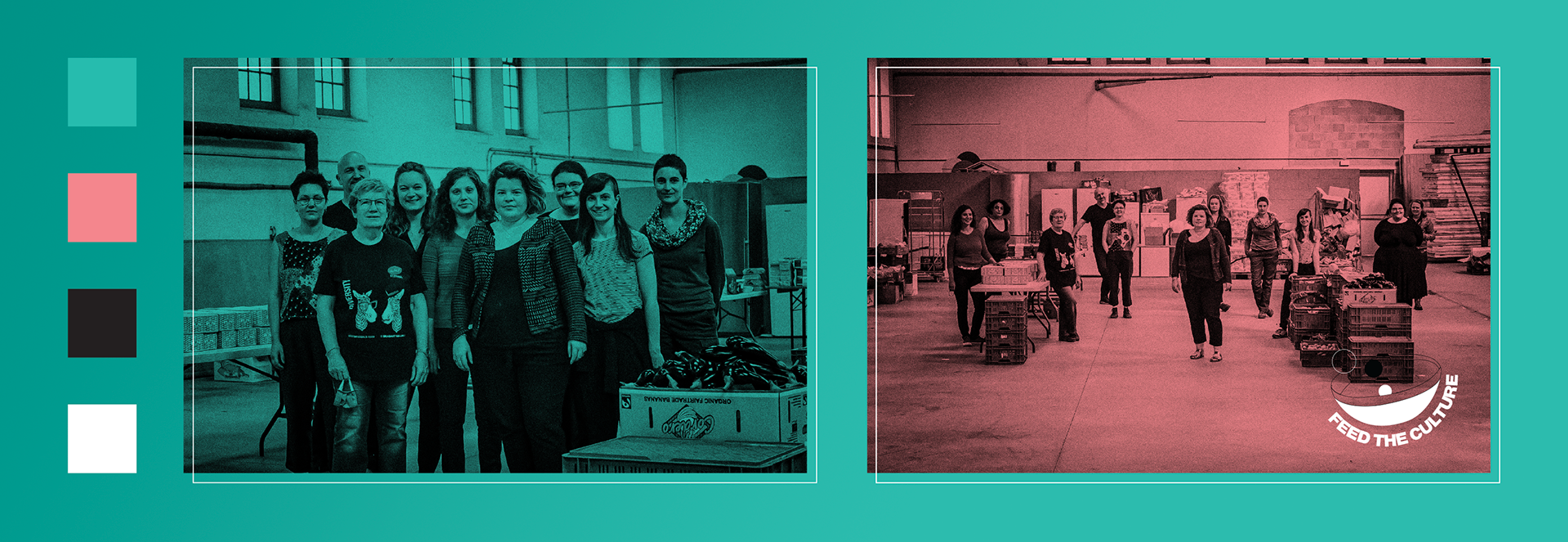
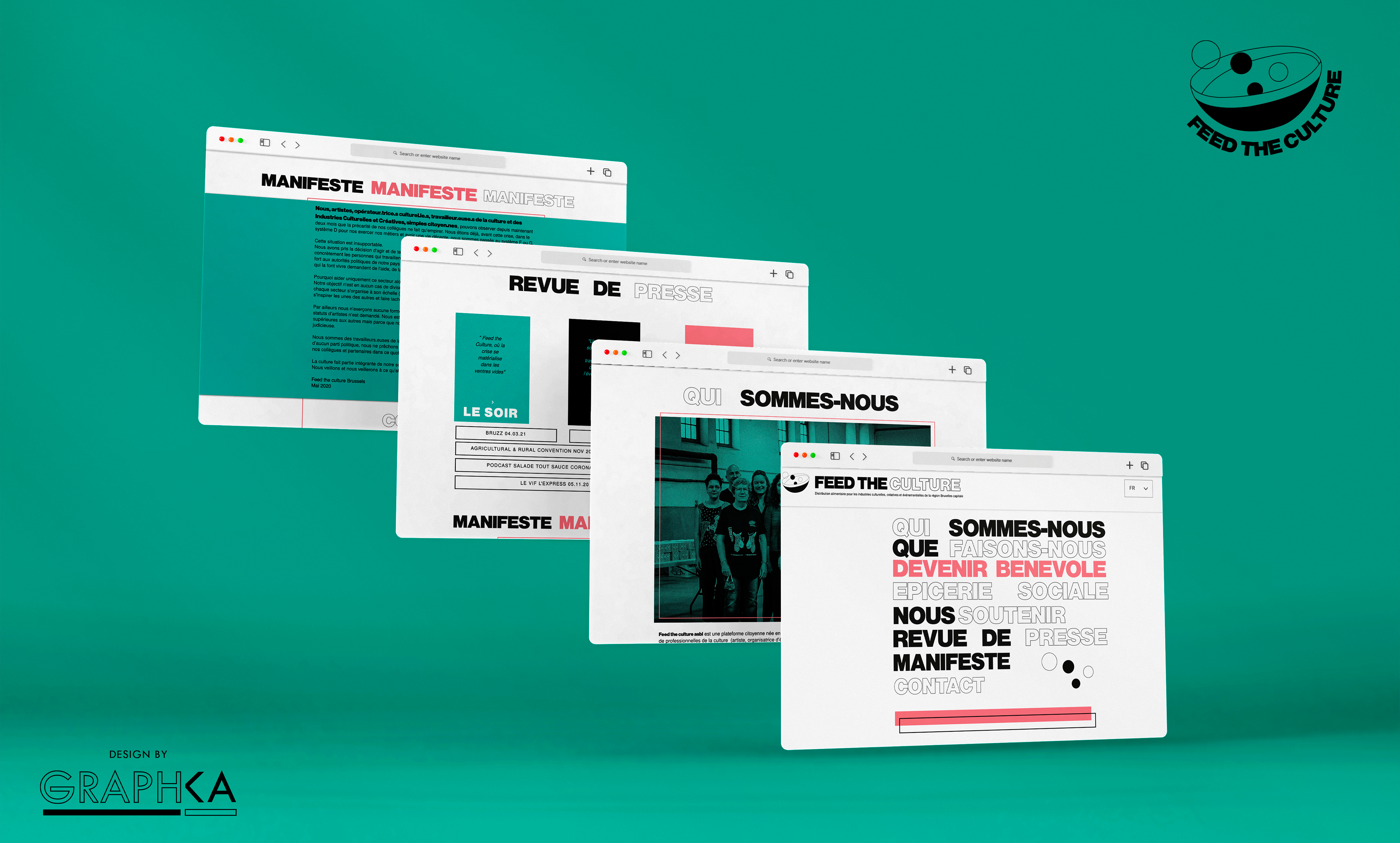
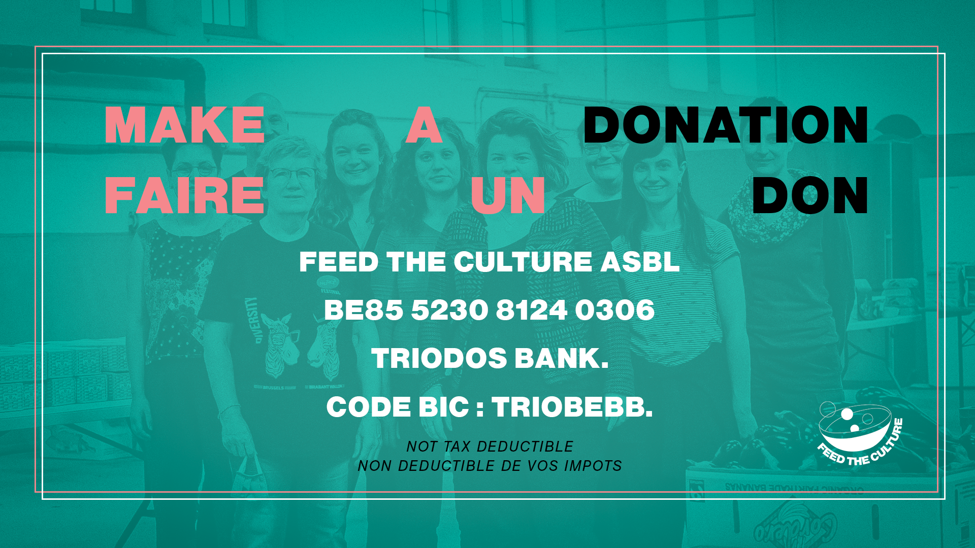
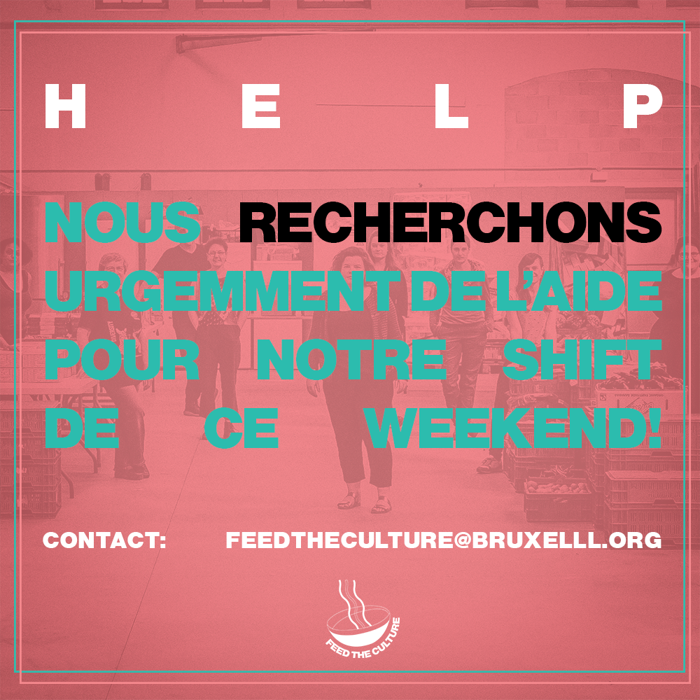
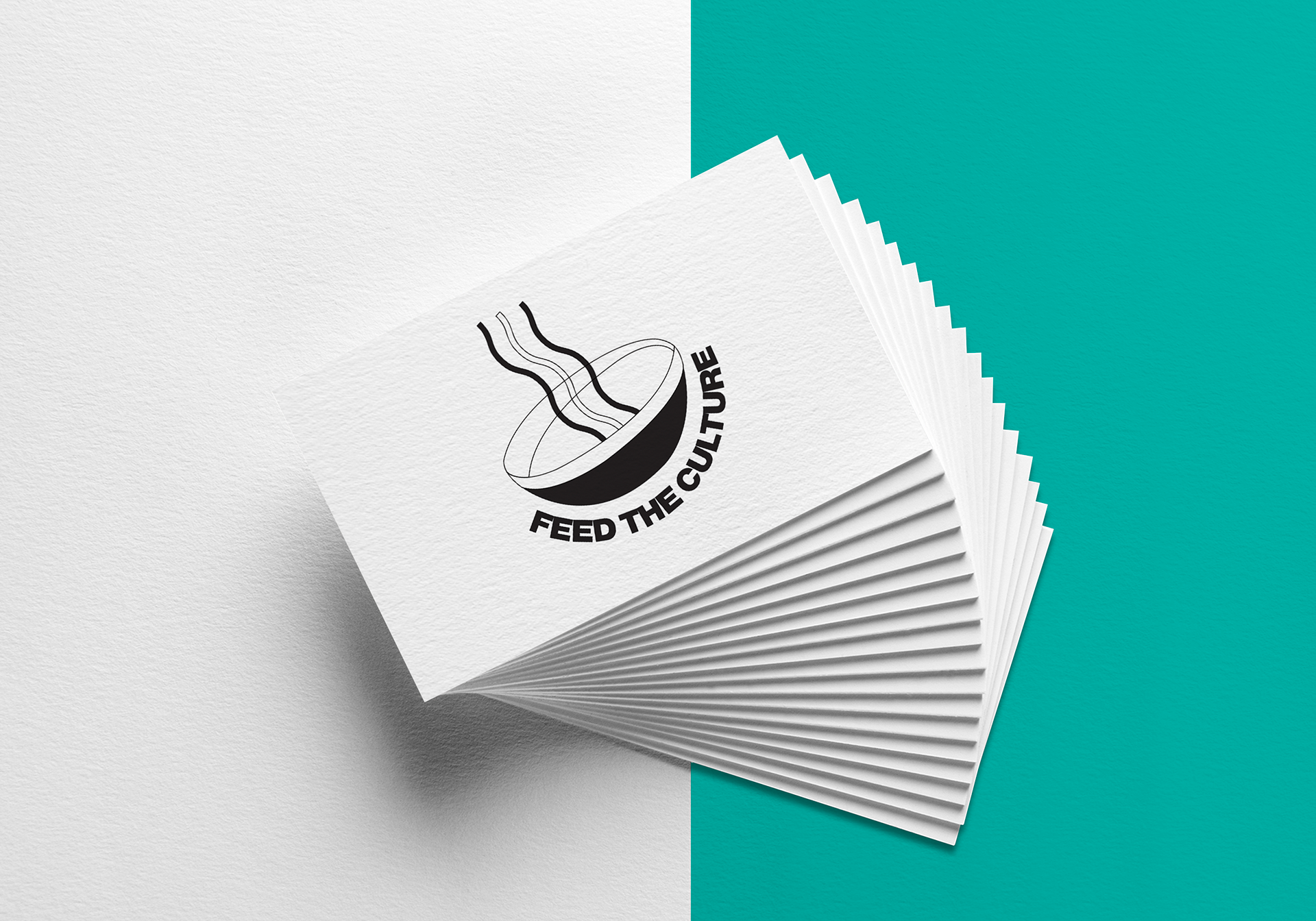
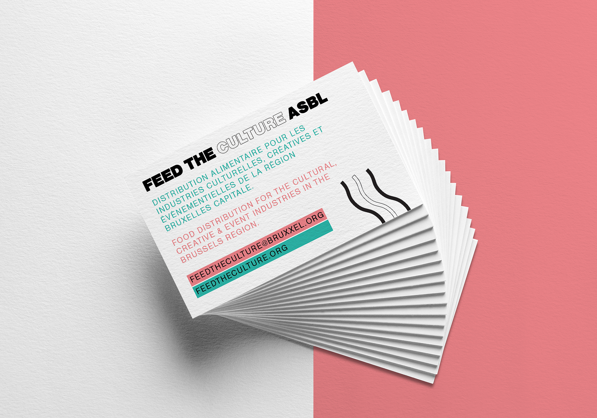
Designing a new graphic identity for Feed the Culture Brussels, a social grocery store / food bank made for workers & artists from the creative and cultural industries. The project was launched during lockdown somewhat urgently and needed to settle and affirm a solid identity. We helped heading this way with this new graphic line, very strong, pop and clear to read. For the logo I decided to go a few different ways as to represent the diversity of the sectors represented. The client can chose to use one or the other versions of the logo depending on the context. Font is Nimbus Sans Becker, a great punchy sister of Helvetica.
Check the website at www.feedtheculture.org.